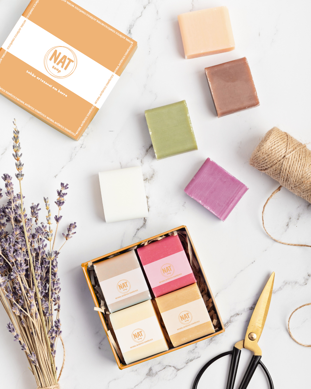
Logo, wrapper and box for a handmade soap brand
NAT soap - a portuguese handmade soap brand. NAT means Natural, Authentic and Therapeutic.
All soaps are made with natural products and oils with therapeutic properties.
That´s why we created a clean logo, using as a graphic element a reference to soap bubbles, and 2 types of typeface, one sober and the other one handwritten, to represent the authenticity of the product and the artisanal way in which it is produced.
The wrapper is very simple, just a semi-transparent white stripe around the soap with the logo in the front. The technical information is located on the sides.
For the box, we thought it would be a good idea to follow the former concept, so, the box is basically a big bar of soap with the wrapper.